

Apr 20, 2021 by TONI KLEMM
Chocolate and hiking trips aside, there are few things I like more than intuitive and informative figures about scientific data. Visualizing our research in intriguing and comprehensible ways is essential in sharing it with peers, stakeholders, decision makers, and the public. Examining a figure can be more time-efficient than reading, and figures can more easily point out details and connections and be more engaging, convincing, and inspiring than text. Scientists themselves have recognized this and in the past few years shifted from often plain to more compelling graphics.
With help from a book on data visualization, I will discuss a few examples of how we can use diagrams, charts, and other visual aids to help communicate scientific data and get a message across in effective and convincing ways.
One note: As with all scientific information, scientists have an ethical duty to present data in an accurate way. Our work forms the basis not only for future research, but also for management decisions, economic investments, and policies. Presenting incomplete data to fit a narrative or argument not only fuels doubt and skepticism in science, it also erodes the trust created by generations of scientists.
Lillian Pierson, in her book “Data Science for Dummies,” describes three types of data visualization, each for a different purpose and audience, which we will discuss here from complex to simple.
1: Data showcasing (complex visuals for analysts and peer researchers)
2: Data storytelling (simple visuals for decision makers)
3: Data art (captivating visuals for activists and the interested public)
1. Data showcasing
Goal: Communicating scientific information in great detail
Audience: Experts, peer researchers
Difficulty: High
Data showcasing is used to present complex data to an expert audience who need to draw their own conclusions, for example fellow scientists at a conference. This type of visual often has several takeaways, and because of that, examining it can take longer. While this type of visualization appears easier to make at first, because it seems like it needs less refining and “boiling down,” it’s actually just as difficult.
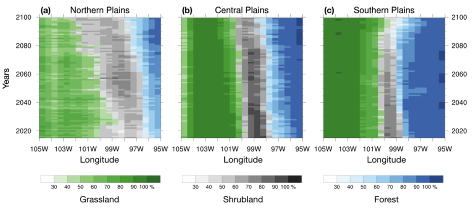
Hovmöller diagrams are intriguing because they condense an enormous amount of information. But while they appear to be easy to understand, they are in fact easily misinterpreted. At first glance, it may look as if they show longitude versus latitude, which would be a snapshot in time. They also seem to show that grasslands in the Northern Plains are disappearing over time near the longitudes of 100 to 101ºW (or shrublands in the Southern Plains), which they do not. They are simply becoming less dominant as shrubland (or grassland) is encroaching. Our graph also glosses over the facts that the vegetation period may become longer and that the composition of grassland, shrubland, and forest areas is changing over time. For example, less nutritious warm-season grasses gradually replace more nutritious cool-season grasses, both of which affect cattle grazing.
All of these aspects require separate figures to present a fuller picture. The presenter needs to consider that viewers may not familiar with this graph and introduce in a manner that viewers are not overwhelmed by the amount of information.
2. Data storytelling
Goal: Selective display of complex information
Audience: Decision makers, stakeholders
Difficulty: Medium
Data storytelling is a way to “unwrap” complex data such that it doesn’t take an expert to understand it. It is ideal for decision makers, stakeholders, or listeners (or viewers) that need to use the information for practical purposes or act on it in some way.
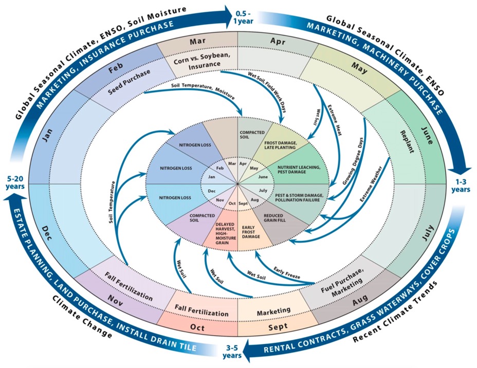
The descriptive math to convert the matrix into a circle was mostly straightforward: months get numbers from 1 (January) to 12 (December), each get multiplied by the number of responses, added up, and decided by the total responses for the mean. The lengths of the blue and yellow circle segments are the standard deviation, which helped reduce clutter and emphasize the clusters.
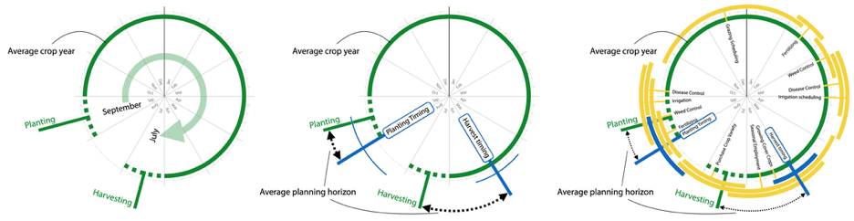
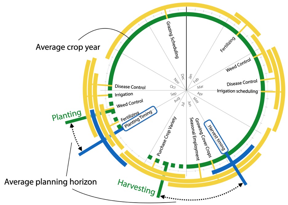
In presentations I sometimes walk people through these three stages. The left circle shows the growing period for winter wheat (September – July), in circle in the middle also shows the planning period for planting and harvesting. On the right, we see the complete figure with the planning periods of all decisions I studied. I use this graph to illustrate the decision planning process and that it occurs several weeks to months before crop planting, harvesting, etc.
One exception to the “straightforward math” was calculating mean and standard deviation for grazing scheduling. Because it was centered around December and January, the mean according to the normal calculation would have been in June or July, which is wrong. Modular arithmetic was the solution. It uses radians, sine, and cosine to account for the circular nature of my calendar to calculate means and standard deviation. Jason Slemons, a friend and Ph.D. mathematician, and Elinor Martin, who is a professor in meteorology and was a member of my Ph.D. committee, helped me figure this out.
3. Data Art
Goal: Convey urgency, make a statement
Audience: Activists, interested public
Difficulty: Low
Data art is used to drive home a specific point about the data on display. It is not so much the communication of scientific information, but to transform data to highlight patterns, convey urgency, take a stance towards a cause, or simply to create eye-popping visuals about a particular topic that stick with people.
A good example for data art related to climate change is Ed Hawkins’ #ShowYourStripes initiative, which uses observed climate data to show the change in temperature globally or for a specific region since 1850 (or later, depending on when records started). The minimalistic design of vertical stripes is very recognizable, used by people as social media cover images, or printed on just about everything from coffee mugs to flip-flops. Windy.com wind maps turn mountains of atmospheric data into elegant, dynamic airflow maps. An entire website dedicated to data art is www.informationisbeautiful.net, which runs “Beautiful News Daily” that visualizes data on positive news (we can all use positive news right now, can’t we?), from the timeline of phasing out coal power in the UK to declining chronic homelessness in the U.S. over time. Some data art, like the wind map example, requires sophisticated software or code, but many visuals, such as Ed Hawlinks’ climate stripes, can be created with tools like MS Excel and Powerpoint, that many of us already have on our computers.
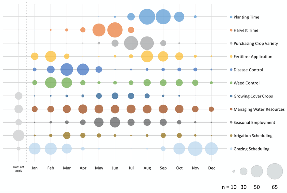
My own example comes again from the world of agriculture. Underlying the bubble graph above was a survey question about the timing of certain management decisions whose responses lend themselves to this kind of visual. We asked agricultural advisors to tick boxes in a matrix to indicate in which month(s) farmers plan certain management practices (we used the same data for the circle graph earlier). Bubble graphs are a feature in Microsoft Excel. Bubble size shows the number of responses. It’s easy to see that most decisions are clustered around certain months and overlap with other decisions. We can also calculate averages and standard deviations from these survey data (which I did for the circle graph), but simply presenting the data like this can have multiple uses, too. It can help to get a first sense of the survey results, help researchers, USDA employees, or policy makers identify busy months for winter wheat farmers, which they may want to avoid when planning listening sessions or visits to agricultural stakeholders. Last but certainly not least, data art has the potential to produce eye-catching and memorable figures that give people pause as they curiously study your poster or presentation … and then approach you with questions and comments. It has worked more than once for me.
Header photo: © Kim Klockow-McClain
Related reading:
- Lillian Pierson (2017): Data Science for Dummies, 2nd edition. Wiley.
- The New York Times: “What’s Going On in This Graph?”
- David McCandless: “The beauty of data visualization” (talk at TEDGlobal2010)
- beautiful news daily (website)
- Nadieh Bremer: Using “Data Storytelling” with a chord diagram (blog post)
- Ed Hawkins: #ShowYourStripes
